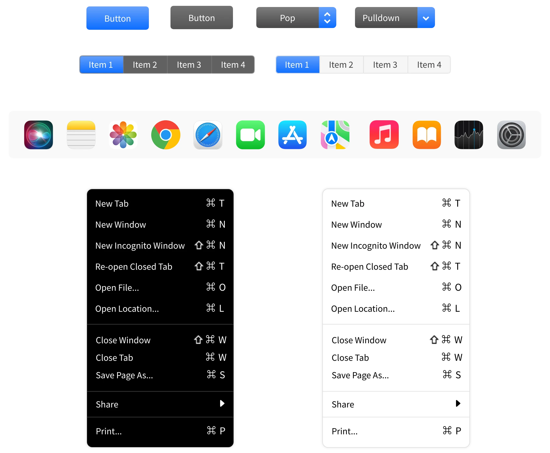
The macOS 14 Sonoma UI Kit in MockFlow is a comprehensive design resource that enables designers to create wireframes and prototypes tailored to Apple's latest macOS 14 Sonoma interface. This kit includes pre-designed components, layouts, and elements that replicate the macOS design aesthetic, providing an intuitive and visually consistent foundation for app and UI development.

Why Choose the MockFlow macOS 14 Sonoma UI Kit?
- Design Like a Pro: Stay ahead of trends with components that reflect Apple's latest macOS design standards.
- Save Time: Drag, drop, and customize with ease, no need to fuss over the details.
- Unmatched Flexibility: Every component is editable, from colors to layouts, allowing full customization for any project.
- Ready for Collaboration: Effortlessly share your wireframes with teams, stakeholders, or clients for seamless collaboration.
What Is in the macOS 14 Sonoma UI Kit?
The MockFlow macOS 14 Sonoma UI Kit is categorized into various sections to cover the entire spectrum of iMac app design components.
Frames and Wallpapers
The kit includes default macOS 14 frames and wallpapers, capturing Sonoma's sleek visual style. Designers can use these to create realistic mockups and set the visual tone for projects, aligning them with Apple's latest design guidelines.

Menu & Buttons
From the dock to menu bars (light and dark modes), these pre-designed elements replicate the iconic macOS look. The kit also includes dropdown menus styled for light and dark themes, allowing you to visualize and prototype contextual interactions quickly. These components make it easy to integrate macOS-native menus into your designs without worrying about the finer details.

Popups & Notifications
Popups are designed with modals, alerts, and dialog boxes that reflect macOS’s minimalist and user-friendly approach. These include standard styles for confirmations, warnings, and informational messages.
Whether it's notifications with actions, titles, or buttons, both light and dark variations are included to match different interface themes seamlessly. These components allow you to prototype dynamic scenarios like system settings alerts, FaceTime call notifications, or download progress tooltips with precision.

Widgets
The widget components in the macOS 14 Sonoma UI Kit let you bring interactive elements into your wireframes effortlessly. From generic widgets to more specific designs like calendar, weather, and notes widgets, these components are tailored to showcase dynamic information on dashboards or home screens.

Form Elements
The form elements in the macOS 14 Sonoma UI Kit are designed to make creating clean and intuitive input interfaces effortless. From value inputs in both light and dark themes to radio buttons, checkboxes, and steppers, these components cover all the basics for user interaction in a modern macOS app.
The date input fields provide a quick way to wireframe date selection workflows, while the combo boxes come in light and dark variants for seamless integration into different design themes.
These pre-made components help you focus on your design's functionality and flow, ensuring your forms not only look polished but also stay true to macOS Sonoma's aesthetic standards.

Memoji & Icons
The Memoji set in the UI Kit brings a playful yet polished touch to your wireframes and prototypes. These avatar components lets you add personality and relatability to user interfaces, making them perfect for projects focused on user-centric features like profiles, communication tools, or onboarding experiences.
From functional icons like copy cursors, resize indicators, and loaders to app icons such as Safari, Photos, and Settings, the icons collection ensures your wireframes stay true to the macOS ecosystem.

Other Elements & UI Screens


Get Started With macOS 14 Sonoma UI Kit
Follow these steps to design your macOS 14 UI using the macOS 14 UI Kit from MockFlow:
- Log in to your MockFlow account. (Sign up here if you are new to MockFlow)
- Create a new wireframe project and in the elements section, choose -' Add new UI Pack' and then search for the macOS 14 Sonoma UI kit in the UI packs.

- Add the kit to your project.
- Drag and drop components directly into your wireframe.
- Modify colors, sizes, and alignments to fit your design needs.
- Adjust component properties to refine your wireframe layout.