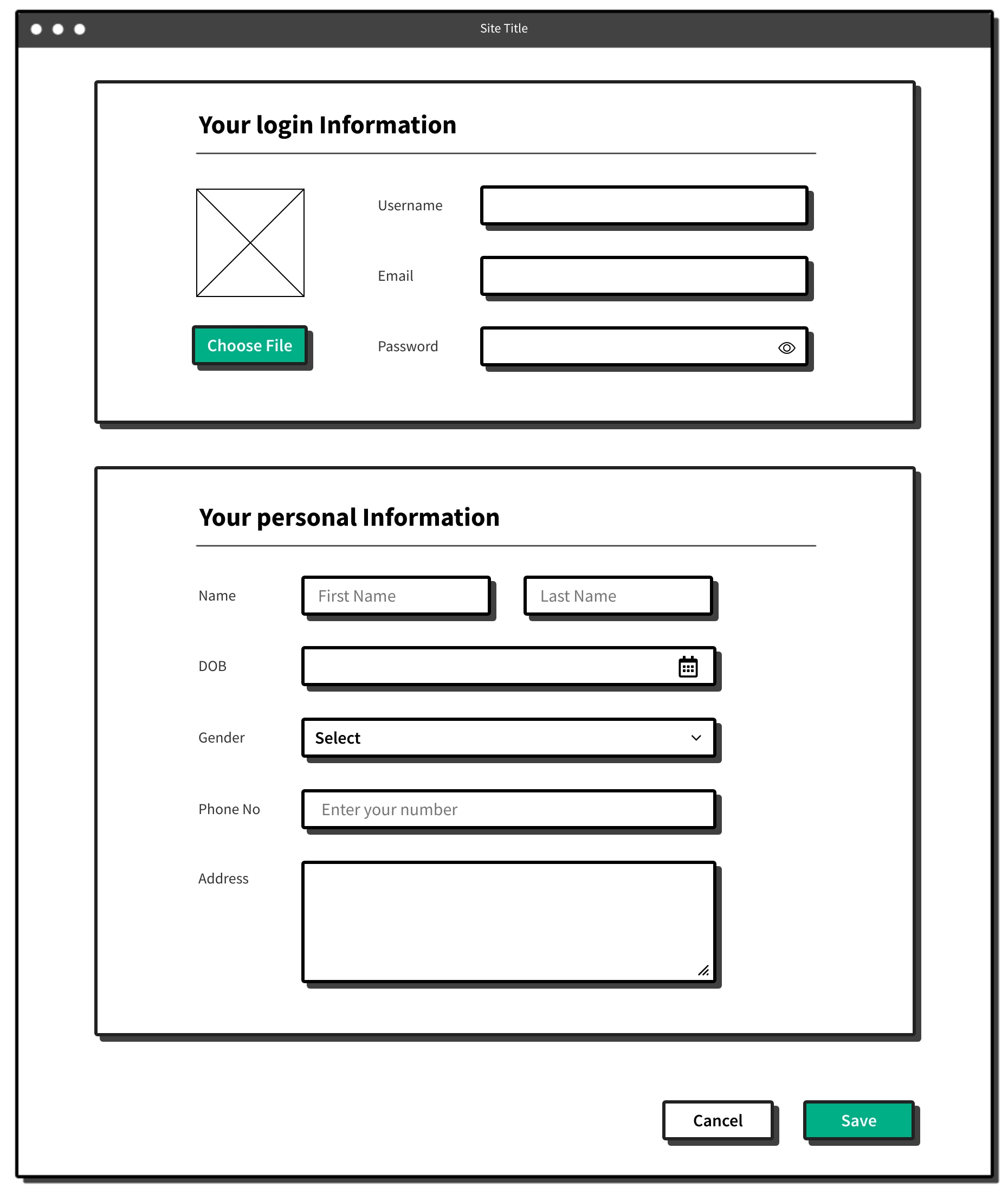
The Blocks UI Kit is a collection of user interface components designed with the blocky wireframing style. It features thick-outlined, simplified elements that can be used to create structured layouts for websites, web applications, mobile apps, and dashboards. It allows designers to quickly visualize the flow and functionality of a user interface without being bogged down by aesthetics.
The kit is perfect for low-fidelity wireframing, where the focus is on the layout and structure of a design rather than colors, typography, or branding.
What is Block style wireframing?
Blocky wireframing is a visual representation style that uses rectangular or square blocks with bold outlines to define the structure and layout of a user interface. Unlike detailed wireframes or mockups, this style intentionally avoids aesthetic elements, keeping the focus on functionality, spacing, and hierarchy.
This style closely mirrors the sketchy style but replaces the hand-drawn, freeform aesthetic with a more rigid, geometric approach that mimics blocks or building bricks. In blocky style, incorporating a limited color palette, such as your brand's primary color, can add a touch of vibrancy to your initial wireframes.

Why Choose the MockFlow Blocks UI Kit?
- Early-Stage Ideation: Ideal for brainstorming layouts and flows without being distracted by design details.
- Team Collaboration: The simple and clean design makes it easy for everyone to understand and contribute, including non-designers.
- Rapid Iteration: Quickly test different layouts and adjust them based on feedback.
- Low-Fidelity Standards: Keeps designs intentionally simple, promoting functional discussions over aesthetic preferences.
What is in the MockFlow Blocks UI Kit?
The MockFlow Blocks UI Kit is categorized into various sections to cover the entire spectrum of mobile app or website design components.
Basics
This includes the essential components designed in a bold blocky style, perfect for low-fidelity wireframes. It includes versatile buttons with variations such as options with or without icons, rounded corners, and accent colors to highlight actions. Basic shapes like squares, rectangles, ovals, and triangles form the foundational building blocks for layouts, acting as placeholders or structural elements. The thick outlines and clean design make these components ideal for quick prototyping and focusing on functionality over aesthetics.

Menu & Card components

Elements & Form Elements
The Elements category features a diverse range of UI components, including notification blocks, pagination, images, progress bars, and other essential elements that enhance both the design and functionality of the interface.
The form elements in the kit include input fields, checkboxes, radio buttons, drop-down menus, and text areas, enabling users to submit data effortlessly. These components are essential for creating user-friendly forms, such as sign-ups, and surveys, and are fully customizable to align with the design's style.

UI Screen
The UI screens in the Blocks UI Kit offer full-page layouts that enable designers to quickly organize and set up content for web or mobile interfaces. The kit includes screens for account creation, login, user forms, and a website landing page, along with examples inspired by Gmail and Google Slides. These flexible templates can be customized with additional UI components to create complete, functional designs tailored to specific app or website screens.

Advantages of Using the Blocks UI Kit
- Faster Design Workflow: Ready-to-use components save time when drafting wireframes or conceptual designs. It simplifies the design process by eliminating the need to create components from scratch.
- Focus on Structure and Functionality: Helps teams concentrate on the placement and flow of elements rather than visual details. This further encourages discussions around usability and user experience.
- Encourages Collaboration: The abstract nature of the blocks makes it easier for designers, developers, and stakeholders to provide feedback and suggest changes.
- Adaptable for Multiple Use Cases: From web apps to mobile interfaces, the kit can be tailored to suit a variety of design projects.
- Ideal for Prototyping: The low-fidelity approach ensures rapid iteration without overcommitting to a polished design.
Get Started With Blocks UI Kit
Follow these steps to design your website or mobile app UI using the Blocks UI Kit from MockFlow:
- Log in to your MockFlow account. (Sign up here if you are new to MockFlow)
- Create a new wireframe project and in the elements section, choose -' Add new UI Pack' and then search for the Blocks UI kit in the UI packs.

- Add the kit to your project.
- Drag and drop components directly into your wireframe.
- Modify colors, sizes, and alignments to fit your design needs.
- Adjust component properties to refine your wireframe layout.
The Blocks UI Kit is a powerful resource for designers and product teams working in the early stages of UI/UX design. By focusing on thick-outlined, blocky components, the kit enables quick visualization of ideas and fosters collaboration without the distraction of design details. Whether you're creating a new app, dashboard, or website, the Blocks UI Kit streamlines the process, making it easier to experiment, iterate, and refine your ideas. Get started today!